Matt Damon The Adjustment Bureau Part 2
The Adjustment Bureau
Cast: Matt Damon, Emily BluntDirector: George Nolfi
Genre: Thriller
Rated: MA
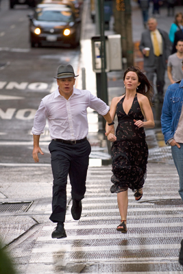
Synopsis: Matt Damon stars in the thriller The Adjustment Bureau as a man who glimpses the future Fate has planned for him and realises he wants something else. To get it, he must pursue the only woman he's ever loved across, under and though the streets of modern-day New York. On the brink of winning a seat in the U.S Senate, ambitious politician David Norris (Damon) meets beautiful contemporary ballet dancer Elise Sellas (Emily Blunt) - A woman like none he's ever known. But just as he realises he's falling for her, mysterious men conspire to keep the two apart.
Release Date: March 3rd, 2011
Bureau Headquarters: On Location in Manhattan
Aside from the fact that David Norris is a congressman from the area, New York City represented much within the context of the film. "New York is central to my vision of the story for a number of reasons," George Nolfi says. "If there is an American city that stands for the most powerful city-the city where the headquarters of Fate would be-it's got to be New York.
"Aside from filmmaking, my favorite art forms are architecture and dance," he continues. "So by setting it in New York and constructing in my head an Adjustment Bureau that was a big, massive, tall building-that allowed me to play out my interests in architecture. Then, Elise allowed me to get into the da
nce world. Both of those things are centered, at least in the U.S., in New York City."To build the visual style of The Adjustment Bureau headquarters-a timeless structure that exudes power-the team leaned on production designer Thompson and location manager Rob Striem to create a pastiche of rooms, roofs, stairwells and façades from some of New York's most stylied buildings. Reflects producer Bill Carraro: "The richness of these practical locations are particularly hard to duplicate, and we needed to access some of New York's toughest places to gain permission to film."
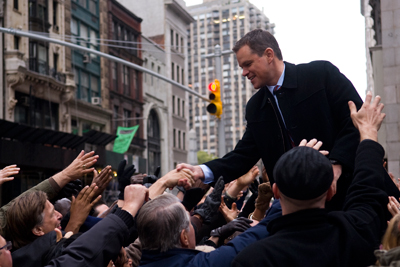 "When I first met with George Nolfi, he had only a half dozen reference pictures, but they were all strong imagery of a particular era in New York-moody and graphic," says Thompson. "Those images, along with the script, immediately gave me a lot of information about where he was coming from."
 Specifically, George Nolfi drew inspiration from notable structures throughout history that implied spiritual weight. "If you think about the history of architecture, Greek temples or the Vatican, or large-scale buildings in which human beings feel small, they are suggestive of otherworldly power," George Nolfi explains. "I went out of my way to pick the most beautiful spaces I could find to suggest that if they controlled things...this is what that world would look like."
"The Adjustment Bureau itself is an amalgamation of different locations," says Rob Striem. "I worked with Kevin to piece together rooms and spaces, interiors and exteriors that are architecturally appropriate but might be on opposite ends of New York. In the movie they comprise this singular office building. It's been a challenge to make it all look correct to the period of architecture and the nature of the location."
As he is quite familiar with New York, George Nolfi already had many of the locations in mind, whereas other locales he happened upon while walking to lunch around the city. If a structure struck him as beautiful and of a similar style or era to the other buildings he was considering for his Adjustment Bureau palette, it was marked for scouting.
So what exactly makes up the palette of the firm? "It's a lot of white or tan marble, with dark wood similar to 1910, 1915 New York," George Nolfi clarifies. "It's not quite Art Deco, because Art Deco announces itself, like the Chrysler building. It's not these heavy baronial giant columns. It's got this soaring feel that Art Deco has. But then it has some of the heavier features�Beaux Arts is what that would be called. We just found a way to mix them."
"The physical structure of The Adjustment Bureau is a made-up building that exists in the middle of Manhattan, and it is a composite of six different great locations in the city that we cobbled together," explains Thompson. "We took the base of a building in Madison Square Park. We took the roof of a building in Midtown. We took the lower sections of the New York Public Library. We were in the U.S. Custom House downtown for some of the hallways and stairwells. We took pieces that all represented the grandness and perfection that was found in a certain period of architecture in the city, and we married them together."
Thompson elaborates on creating the world of The Bureau from existing locations: "Quite often in the spaces and rooms, we took out the details such as exit signs or light switches. We wanted to represent the space in its purest form without the sort of things that have been added in the last few years."
Based on the sheer number of locations, shooting in the city proved to be a bit of a behemoth. Says Rob Striem, who has worked on such recent location-heavy New York projects as Across the Universe, The Interpreter and The Brave One: "There are probably more locations on this film than any that I have ever done in New York. We had about 85 locations during a 70-day shooting schedule. We were rarely in one place for any length of time, so this was a paramilitary operation."
Some of the locations used for pivotal scenes include the roof of 30 Rockefeller Center, also known as Top of the Rock; the New York Public Library; the historical Custom House in lower Manhattan (home to a Native American museum and offices of Homeland Security); the Waldorf Astoria hotel; 60 Centre Street courthouse; Fort Tryon Park and its New Leaf Restaurant & Bar; the South Street Seaport neighborhood; the Fulton Ferry Landing in Brooklyn; the field at Yankee Stadium; the performance and rehearsal space of the actual Cedar Lake dance company in Chelsea; Madison Square Park; and the streets of the West Village. Scenes were even filmed on the Hudson River on a Circle Line ferry that moved up and down alongside Manhattan's west side.
Michael Hackett appreciated the unfettered access to some of New York's most spectacular landmarks the team was given. In fact, for a pinnacle moment in which Elise and David find themselves on a huge, expansive roof of The Adjustment Bureau, the production had yet to find a viable location. George Nolfi and Michael Hackett happened to be sightseeing on the roof of 30 Rock with family when they realised they had found the perfect locale.
"Initially we were looking for size," Michael Hackett explains of 30 Rock's modest roof space. "By doing the opposite of what we tried to do initially, we found something more useful and dramatic. The location that we found suggested something that we weren't thinking of when we first went through the movie and blocked it out."
Because so many locations were put together to represent singular areas, much attention had to be paid to continuity. "George Nolfi has been diligent about wanting to be geographically correct," Rob Striem observes. "Even though the agents are moving through doors and crossing town, George Nolfi's been conscious not to make it incorrect. We're not going downtown when we're supposed to be progressing uptown in pursuit."
Accomplished cinematographer John Toll was integral to capturing this unseen magic of the city. "Toll was a crucial piece of the puzzle for how the film looks," stresses Chris Moore. "The movie has multiple balls that are in the air, and the audience is going to need to seamlessly move in between the action and the love story."
Beyond the singular beauty of New York City, however, the story of The Adjustment Bureau called for locations and rooms that could not possibly exist in the real world. Though George Nolfi aimed to keep the look as realistic as possible, and rely on actual footage when he could, there was a point when the production needed to bring in the special effects. Remarks Michael Hackett: "It's the forward edge of filmmaking in terms of what's done and how. Whether it's visual effects or real shoots, miniatures or a combination or composite�there are 15 ways to skin a cat."
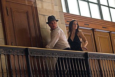 To create the seemingly impossible Escher-like stairs, hallways and rooms of The Adjustment Bureau's main offices, George Nolfi relied on Thompson to build new sets, as well as on visual effects supervisor Mark Russell to create the unimaginable and add on where needed. Russell's previous work on another Philip K. Dick-inspired film, Minority Report, assured that he was familiar with the author's unique sensibilities.
 Because the agents travel through doorways throughout the city, the art direction crew had to make sure how the men moved made sense. "A lot of our concentration and our construction involved doorways-like combining this side of this door with that side of that door," Russell explains. "Which way does it swing? Which door exists in reality, and which door do we have to create on a location so that it will match up with what's supposed to be on the other side?
"My favorite thing is weaving it all together and making sure that it feels seamless," Russell continues. "There are other locations that we built to look like they've always been there. Those are the things I'm most proud of�when they disappear into the tapestry of the movie."
Many times the perfect visual location had layout issues that would impede the narrative of the scene. For example, though the roof of 30 Rock provided the perfect expanse for the climatic scene with David and Elise, reaching the top of this building after a stairwell chase could not be done at 30 Rock.
"We built a stairway that's on top of The Adjustment Bureau," Thompson explains, "with a big green screen around it. Then we took sections of that and put it on the roof of our building on which we shot the climatic scene. So, a lot of the construction we did was to tie in different locations to one another, supported by visual effects."
Perhaps the greatest feat for both Thompson and Russell was creating the Plan Room, the library of The Adjustment Bureau. In the story, this library exists on the 90th floor of the fictional New York building. But a room in The Adjustment Bureau headquarters cannot be understood logically through the lens of a human eye. Much like the roof-staircase trick, Russell and Thompson needed to create an infinite library. This needed to be comprised from only one shot of an empty room at 20 Exchange Place in New York that was chosen for inspiration. It also needed to work within the context of a chase scene in which Elise and David are running from agents.
The intended effect of playing visual tricks on the characters, as well as on the audience, is to build the scope of The Adjustment Bureau beyond human comprehension. "The idea is that this is one section of a large room. We only had one section to actually shoot," explains Russell of the book-filled space that the crew replicated ad infinitum. "It's 13 setups essentially, from different angles and different pieces that ultimately come together to make the Plan Room," he continues. "This is a fast sequence, but it seems much more elaborate than it is."
The Suit Makes the Man: Wardrobe of the FilmTo complement the carefully selected architecture within the world of The Adjustment Bureau, George Nolfi knew that the agents' wardrobe should also visually set them apart from humans�without drawing too much attention to their presence. The director decided to express this mystical notion with the most unassuming of apparel: timeless suits and hats.
In theory, agents of The Adjustment Bureau dress in clothing similar to the outfits worn by the humans that they shadow. Because David Norris is a well-heeled politician, the agents in his life mirror the more formal attire.
"The idea was to have great-looking suits and hats, but not to have them indicate any one specific time period," says Michael Hackett. "It could be '40s, it could be '30s and it could be today. There's something retro but also modern about them. It's evocative and adds to their otherworldly element without having them be exaggerated angels or demons with nonanthropomorphic bodies."
The powers of The Adjustment Bureau are a clever function that George Nolfi instilled into his visual symbols: the ability of agents to travel through the fabric of the city under the radar and to adjust humans. "In order to use their higher powers, agents have to have a hat on," George Nolfi says. "Inside all the hats there is a power ranking; the higher-up executives have hats that allow them to use more power to influence humans.
"It also fits nicely with the architectural palette of the movie because there's this morphed combination of early 1900s New York architecture," George Nolfi adds. "In that period in men's dress, all men wore hats."
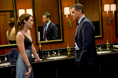 To bring the director's vision of crisp, timeless suits and stylish, yet unassuming hats to life, costume designer Kasia Walicka Maimone was tapped to cull the looks from a much more dapper time. As Kasia Walicka Maimone remembers, few words were spoken between her and George Nolfi when they first met, as they simply browsed and selected images from her inspiration boards, coming together on a vision for the costumes.
 "I had plenty of photographs, so we could both find our visual language just by responding to those images. That's how we started building the vocabulary for the film," she explains. "George Nolfi was interested in portraying reality as it is-close to reality. All the characters were not completely real, but they had to be rooted in reality."
For a timeless look that could be pulled off in the modern day, they began looking at 20th-century styles. "We looked at a lot of references from period clothing, beginning at about 1910, when men's contemporary clothing language was invented. All the suits are trim in fit, and we created this quiet palette of grays and dark greens, with streamlined silhouettes. We felt that for The Adjustment Bureau, all the guys needed to have that function of being able to blend in among the street crowd."
For the suits to conform with the hats' nod to a higher power, George Nolfi and Kasia Walicka Maimone considered what touches they could add. "We kept thinking, 'What is the color that calls for all the powers that The Bureau is supposed to represent?' Intuitively, I thought it needed to be green, and that green needs to trickle down all through The Adjustment Bureau. It needed to stay within that quiet palette."
However, the look of the agents also has an ominous and militaristic feel. Just as when one visits the inside of The Bureau, there is a clear, regimented order to how they operate. "The leading vocabulary for us was that The Adjustment Bureau has a military elegance: it's a streamlined, clean-lined; everything is pressed and strict," Kasia Walicka Maimone explains. "As George Nolfi referred many times, there is an underlying military-like structure in The Adjustment Bureau, and the ranks are clear."
The costume team spent weeks researching uniforms of military forces from throughout history to find subtle inspiration for the agents' outfits, as well as for the more intimidating Intervention Team of The Bureau. "We knew that we were not going to be in the world of suits with the Intervention Team, because it would take us out of the vocabulary of the film of what needed to feel immediate and instantaneously threatening," Kasia Walicka Maimone elaborates.
To customise each agent's suit, she used material details such as scarves and handkerchiefs. The team also took care to distress each individual agent's hat to give the appearance of a well-worn fedora that has withstood the test of time. The designer reflects: "There is the humanity factor that comes into each of the characters. So each character has slightly different versions of the outfit."
For the characters of David and Elise, Kasia Walicka Maimone developed wardrobes inspired by their professions. In her mind, American politicians have their own uniform: "It was a clear vocabulary that we created for the world of David and the politicians around him: a dark navy suit with a solid tie, a conservative and classic suit. Navy blues, blues and khakis-that became the world of David."
Elise, however, comes from the opposite end of movement and expression. "She needed to have this dramatic contrast to the word of the politicians, of their super-structured uniform look," the designer explains. To accentuate Elise's fun and free attitude, Kasia Walicka Maimone relied on vintage dresses with modern touches and added additional expression through color.
To create Elise's costumes for her dance pieces, Kasia Walicka Maimone worked directly with the Cedar Lake company. The opportunity was exciting for the designer, who views Cedar Lake as "rebels of the ballet world," with an urban, street sensibility to their style. "That process was fun because we knew that we wanted to acknowledge the vocabulary of that contemporary dance company," says KasiaWalicka Maimone. "We collaborated with Swan and with George Nolfi to create this flow, but at the same time, hard-edge, modern, sculptural look for the company."
Part 1 - www.femail.com.au/the-adjustment-bureau.htm
MORE
- Mission: Impossible Fallout
- Glenn Close The Wife
- Allison Chhorn Stanley's Mouth Interview
- Benicio Del Toro Sicario: Day of the Soldado
- Dame Judi Dench Tea With The Dames
- Sandra Bullock Ocean's 8
- Chris Pratt Jurassic World: Fallen Kingdom
- Claudia Sangiorgi Dalimore and Michelle Grace...
- Rachel McAdams Disobedience Interview
- Sebastián Lelio and Alessandro Nivola...
- Perri Cummings Trench Interview


