John Kahrs Paperman

Paperman
Cast: John Kahrs, Jeff Turley, Kari WahlgrenDirector: John Kahrs
Genre: Animation, Short
Rated: G
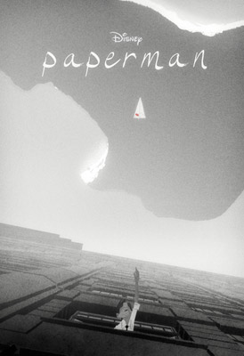
"Paperman," a new short from Walt Disney Animation Studios that debuts this December with the Disney feature "Wreck-It Ralph."
Heart, Imagination and a Stack of Papers
With Touching Story and Unique Style, "Paperman" Takes Art of Animation in a Bold New DirectionIntroducing a groundbreaking hybrid approach that seamlessly merges computer-generated and hand-drawn animation techniques, first-time director John Kahrs takes the art of animation in a bold new direction with "Paperman," a new short from Walt Disney Animation Studios that debuts this December with the Disney feature "Wreck-It Ralph." Using a minimalist black-and-white style, the short follows the story of a lonely young man (George) in mid-century New York City, whose destiny takes an unexpected turn after a chance meeting with a beautiful woman (Meg) on his morning commute. Convinced that the girl of his dreams is gone forever, he gets a second chance when he spots her in a skyscraper window across the avenue from his office. With only his heart, imagination and a stack of papers to get her attention, his efforts are no match for what the fates have in store for him.
"Paperman" was produced by Kristina Reed (a key player in production and development at Disney Animation since 2008), and created by a small, innovative team working at Walt Disney Animation Studios. It pushes the animation medium in an exciting new direction, and is a bold experiment in bringing the organic, expressive and artistic qualities of traditional hand-drawn, Disney animation to the cutting-edge look and limitless possibilities of the CG world. Jeff Turley served as the film's art director. Emmy® Award-winning composer Christophe Beck ("The Hangover," Disney's "The Muppets" and "Under the Tuscan Sun") adds to the film's uplifting mood and appeal with his soaring score.
Helping to give "Paperman" its unique look and style are the contributions of a department the Studio dubbed Final Line. This small team of traditional 2D animators used a proprietary drawing software tool called Meander to create a layer of expressive hand-drawn lines and paint strokes that "stick" to a foundation layer of carefully prepared CG animation in a completely new way, respecting the flatness of the drawn line and using techniques specifically developed for the project. The result is an extraordinary blend of the two animation mediums that is a perfect match for the story and character needs of "Paperman."
"'Paperman' is definitely an attempt to do something different in animation," says Kristina Reed. "John Kahrs and I both felt that so many CG films today are striving for photorealism-we believe there is a whole different visual frontier that should be explored. We wanted 'Paperman' to put something on the table in that direction, and we're hoping that Disney and other studios and artists will continue the conversation about how different animation can look. It's virtually limitless.
"John Kahrs and I both come from CG backgrounds," continues Kristina Reed. "When we came to Disney, we discovered the power of the line, its expressiveness and what our great 2D line artists can do. It inspired us to think about where could go with this."
It All Began With A Morning Commute
Director John Kahrs began thinking about the basic premise for "Paperman" back in the early 1990s when he lived in New York City and commuted 38 miles each way to his job as an animator at Blue Sky Studios in Westchester County. "New York can be an intimidating place," says John Kahrs. "People tend to have their guard up when they're going about their daily routine. I can remember being on the train wishing I could make a connection with someone and have more of a social life. I would come back through Grand Central Station and go straight home. I kept thinking, 'Here I am in the most amazing city in the world and I'm just holed up in my apartment.' Sometimes on my commute, I would see somebody and make eye contact and then that person would be gone forever. I started wondering what if that person was the one for me.
"I also began thinking about the notion of how a couple with a romantic connection would communicate across the big city," continues John Kahrs. "And this idea of throwing a paper airplane from one skyscraper to another was the visual hook that really got my gears turning. I started focusing on how this guy could reconnect with a girl he had made a connection with."
John Kahrs moved to California in 1997 to work for Pixar Animation Studios; the idea for "Paperman" continued to intrigue him. He developed it as a short film and edited together a rough version, but it wasn't until he came to Disney in 2007 and completed his assignment as a supervising animator on the Studio's hit 2010 feature "Tangled" that things began to happen. Encouraged by the directors of "Tangled," Nathan Greno and Byron Howard, and inspired by the artistic guidance of legendary Disney animator Glen Keane, Kahrs began to see new possibilities for bringing "Paperman" to the big screen.
Final Line: Hand-drawn Aesthetics Meet CG Animation to Create the Best of Both Worlds
One of the breakthrough innovations on "Paperman" was the establishment of the Final Line department, where 2D animators were able to add their unique artistry to the CG form and the final animation. This approach, along with new proprietary software innovations, gives the film a new and innovative look and approach to animation.
"One of the things we really wanted to capture with 'Paperman' was the unique style and appeal of hand-drawn animation in our CG animation," says John Kahrs. "Seeing Glen Keane draw over the CG roughs on 'Tangled' and inspiring the computer animators to raise the bar made me start thinking, 'Why do we have to leave the drawings behind?'
"We wanted this short to have the best of both worlds," continues John Kahrs. "CG is my home base and I wanted to get as much performance out of the CG models when I was directing that component of it. The 2D animators were responsible for the beauty and the form of the final image, bolstering the emotion by pushing it even further."
While "Paperman" was in the early stages of development, producer Kristina Reed and director Kahrs heard about the new software drawing program called Meander that was being developed internally by Brian Whited.
Says Brian Whited, "I was hired at Disney to develop a set of 2D drawing tools and to help bring technological innovations to the traditional animation process. This involved working with lots of folks including Rachel Bibb in animation, Jin Kim in visual development and Jeremy Spears in story to find out what their needs were. For a year and a half, I was mostly by myself working on the program. John [Kahrs] Kristina [Reed], Patrick Osborne and Jeff Turley came to my desk one day and said they had heard about my program. I showed them everything it could do and they got really excited because they realised that these tools existed that could help them do what they wanted to do. It was the most perfect timing and I can't tell you how happy this whole project has made me. There's still so much to explore and so much potential. We've really just scratched the surface."
Meander allows 2D animators to have their drawings accurately and immediately married to the 3D animation. Whited explains, "When the animator draws a curve on a piece of paper, the curve they get is exactly what they intended to draw. There's no disconnect between what their hand created and what they see. Until now, a lot of drawing programs have had a problem with trying to smooth the curve too much or make it look nicer, but it isn't what the artist drew. Meander is a vector-based drawing tool that keeps the geometry of the center line of every stroke. It's a piece of technology that allows the artists to have complete control and be the ones to move their great drawings around."
John Kahrs adds, "Working with Glen Keane on 'Tangled' opened my eyes to all kinds of new possibilities for creating animated performances. He is one of the greatest traditional animators of all time and he said he loved having a CG structure to hang the drawing on and to provide an anchor underneath. On 'Tangled,' it was satisfying for him to have the solidity of the CG under Rapunzel's face, yet still have the elegance and subtlety of a line drawing on top. The Meander drawing tool on 'Paperman' allowed us to do what we wanted in terms of look and style.
"With 'Paperman,'" continues the director, "we were very fortunate to have such incredibly talented traditionally trained animators as Eric Goldberg, Sarah Airriess and Hyun-Min Lee enhancing the performances every step of the way. They could change the profile of a cheek bone, draw a beautiful mouth that's exactly the way they want it to look, show just the right amount of teeth, or adjust the eyelashes, pupils or brows. With Meander, their lines track remarkably well for the first time onto the CG animation."
Art Direction: Creating the Look of 'Paperman'
For art director Jeff Turley, creating a stylised black-and-white version of mid-century Manhattan was a dream come true and a chance to explore new directions in animated filmmaking. "John wanted the film to have a contemporary sensibility," says Jeff Turley, "even though it was set sometime in the 1950s. We came up with an approach that was very photographic, but not photo-real. It uses photographic cues. We wanted it to have the rich tonal scale of an Ansel Adams photograph or some of the other photography that was going on during that time. Berenice Abbott and the WPA photographers were also great references for us with their pure, raw imagery of the New York architecture and cityscapes. One of our main goals was to avoid having the art direction look CG. We wanted it to have a handmade feel to it."
A major influence on the look of the film was the more recent street fashion photography that often shoots directly into the light. "There's something about the simplicity of the way they shoot their photography that is just great for Disney characters and animation," says Jeff Turley.
Another element of the film's look involves grain. Says Jeff Turley, "Black-and-white photography has this really rich grain to it. With 'Paperman,' we wanted to find a way to exaggerate the grain a little bit. One of our early thoughts was to make it look like a paper rubbing or a charcoal sketch, but that got a bit too distracting. But we did end up using some grain because it had a quality that just brought everything together, giving the film a nice visceral sense. Instead of using soft focus, which was common to photography from that period, we tried to get a contrasting sharp-edged quality for the buildings to get the look we wanted."
The art direction for "Paperman" represented a rethinking of the way things had been done in the past. There was a greater collaboration between the art and technology sides than ever before, with animator Patrick Osborne taking on a key role of creating the sets and backgrounds. "Patrick Osborne would take a visual development piece-sometimes a very loose sketch-and build something based on that or a storyboard," says Jeff Turley. "Using Maya, he'd create the scene with simple cubes, just to get a sense of space. Then I would take a frame of that, put it into Photoshop and paint over that. Our teams would constantly pass things back and forth until it was right and ready. We had a very guerrilla-like style to making things work. 'Paperman' was a great experiment to see where we can go with the art form and to explore some of the incredible possibilities that are out there."
MORE
- Mission: Impossible Fallout
- Glenn Close The Wife
- Allison Chhorn Stanley's Mouth Interview
- Benicio Del Toro Sicario: Day of the Soldado
- Dame Judi Dench Tea With The Dames
- Sandra Bullock Ocean's 8
- Chris Pratt Jurassic World: Fallen Kingdom
- Claudia Sangiorgi Dalimore and Michelle Grace...
- Rachel McAdams Disobedience Interview
- Sebastián Lelio and Alessandro Nivola...
- Perri Cummings Trench Interview


