Dulux 2020 Autumn Colour Predictions

With life busier and more complex than ever, design trends for autumn 2020 will reflect our desire to simplify and slow down. Calming, nature-inspired tones will dominate, with a focus on simplicity and authenticity. As society becomes increasingly concerned with sustainability and wellness, the idea of 'minimalism with intent' – where spaces are pared back to the essentials and accessorised with décor pieces that are meaningful to us – will come to the fore.
"We've seen a much more tonal palette coming through this year," says Andrea Lucena-Orr, Dulux Colour and Communications Manager. "The bold colour contrasts of previous years have made way for subtle layering of natural hues. Depth is added through texture and materiality."
The Grounded palette – one of four trend palettes identifed in the 2020 Dulux Colour Forecast 'Essence' – combines gentle, earthy neutrals and warm whites with accents of soft coral and lavender to create a cosy, laid-back feel. And as the weather cools, it's the perfect palette to add warmth and character to our homes.
"The Grounded palette is one that homeowners will love – it's easy to work with and has a relaxed yet sophisticated feel," says Lucena-Orr. "Warm, biscuity tones derived from nature feel calm and comforting, and adding in touches of muted coral, mauve and gold gives the look a contemporary edge.
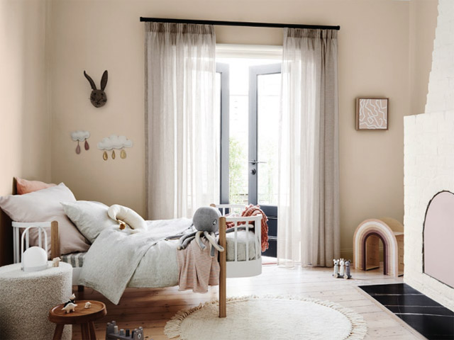
To show you just how quickly and effectively colour can reinvigorate your home, stylist Bree Leech transformed a bland, all-white kid's bedroom using the Dulux Grounded palette.
"Colour is the greatest tool you can use in your home – with very little effort or expense, you can completely change the look and feel of a space," says Leech. "All you need is a few spare hours, a paintbrush and a couple of cans of paint – then it's like stepping into a whole new room.
"This bedroom's all-white palette made it feel a little uninviting – the exact opposite of what you want in a child's room. The room itself has great features, including a high ceiling, a beautiful, solid timber floor, French doors, plenty of natural light and a striking brick fireplace.
"I wanted to add warmth and personality to the space so that its little occupant would enjoy spending time here. I aimed to highlight the room's best features, detract from the less appealing ones – and spend next to nothing. To keep the budget in check, we kept the main pieces of furniture – a feature toddler bed with timber detailing and a curvy armchair and ottoman.
"The Grounded palette was perfect. It's cosy and inviting, but still manages to feel light and airy. With its tones of putty and biscuit, it's versatile enough to make a great base for either a girl's or boy's scheme. Add some personality with elements of soft grey and terracotta or lavender and coral, as we've done here," says Leech.
"When you're choosing a palette, it's best to start with one main colour, which you can use across large expanses, such as walls, then a supporting hue and one or two accents. We retained the existing warm white (Dulux Wash&Wear in Natural White) for the freplace and ceiling; and chose a soft clay (Dulux Wash&Wear in Pancake Mix) for the walls as a feature, to tie in with the warmth of the timber floor and the detailing on the bed; a muted lavender (Dulux Wash&Wear in Hint of Lavender) for the new door on the fireplace opening; and added touches of coral in the bedding.
"We made the bed the hero of the room by piling it high with comfy pillows and using bedlinen in shades of grey and coral. An inexpensive rug adds softness underfoot – its round shape echoes the curves in the furniture. To accentuate the fabulous freplace, we kept it white to subtly contrast with the walls.
"It's important not to add too much clutter to a child's room, particularly if it's small, as you want to give them space to relax and play. We left plenty of breathing space and kept the sheer linen curtains to allow soft light to flter in," says Leech.
"A cosy space such as a bedroom is a great place to start your colour adventure," says Lucena-Orr. "Being a personal space, it's perfect for experimenting with those colours you've been dreaming about. Paint a feature wall behind the bed, repaint the walls or upcycle one or two pieces of furniture, such as a bedside table or stool. And if you tire of it down the track, simply whip out your paint brush again!"
Autumn styling tips:
Go tonal: For larger expanses such as walls and sofas, layer different shades of one key colour.
Keep it simple: Don't overfll the space – include only those pieces you need and love.
Create a focal paint: Every room should have one hero piece to draw the eye, whether it's a stunning side chair or a beautiful artwork.
Add texture: Seek out must-touch upholstery fabrics, such as rich weaves and bouclé's to add textural interest.
Embrace curves: A round ottoman, an arched mirror or a curvy sofa are on-trend and will break up the hard lines in a room.
www.dulux.com.au
MORE


